People had a few questions about the creation of this piece, so I will answer them here. I overdyed the garment with Procion MX dye, and I painted it with Neopaque and Lumiere paint both of which I sell on my website here: Fabric Paints

FIBER ART BLOG, APRIL SPROULE
Wednesday, November 09, 2011
Tuesday, November 08, 2011
Old Brown Dress Reborn
For quite some time I have been saving old clothing that was too nice to either toss or donate. Periodically I will take things out of the closet and think about how I could rejuvenate these tired old garments. This is one of my first pieces of repurposed clothing, and I had so much fun creating this piece that I can't wait to make more.
 |
| Before |
I had enough fabric left to cut small godets, triangular shaped pieces, to insert in each seam to give the skirt a little more flare. I printed these with my stencil in a coral color.
 |
| Back Detail |
Next I used my Fuchsia Stencil on the front and back center panels of the dress. I mixed an orchid pink and a coral rose color for the flowers, and I used a taupe colored metallic paint for the leaves and the scrolls.

 This is the beginning of the stencil process on the front and the back of the dress.
After the stenciling was finished, I heat set all of the painted areas with a hot iron for 3 minutes. Then the garment is washable in cold water.
I sewed the godets into the princess seams of the dress and then sewed up the side seams.

The last step was to finish the sleeves and the hem. This is a technique called lettucing. I once worked with a designer in Canada who was very fond of this technique, so it is probably one of the techniques that I will never forget how to do. You simply use a zig-zag stitch close to the edge of the fabric, and then continue going around the hem stretching it a little more each time so that it stretches out. I went around mine three times. It works beautifully on either knits or bias cut fabric.
This project took me a total of eight hours to complete. Instead of using that old brown dress cut up as cleanign rags or some equally mundane purpose, I have a new piece of clothing that is fun, colorful, and clearly represents my personal creative style. Now maybe it is time for you to go rummage through your own closet and see what forgotten treasures await you there.
Saturday, September 17, 2011
Green Passion Flower
 This little piece has been sitting around patiently for the past couple of months waiting to be completed. I posted earlier photos of the work in progress. Here are the beginning and the end.
This  was a piece of Radiance, silk/cotton blend, that I dyed with Procion dye. I hand stitched around the perimeter of each circle, drew it up tightly, and then bound it with thread so that very little dye would seep in. It sat around for quite a while before I figure out what to do with it. It is a variation of the kumo, or spiderweb, shibori pattern.
 was a piece of Radiance, silk/cotton blend, that I dyed with Procion dye. I hand stitched around the perimeter of each circle, drew it up tightly, and then bound it with thread so that very little dye would seep in. It sat around for quite a while before I figure out what to do with it. It is a variation of the kumo, or spiderweb, shibori pattern.
This piece was painted with my Passion Flower Stencil, and I used Neopaque paint. I used wool batting and Aurafil thread. The red rectangles were made from a piece of Radiance that I dyed a rasberry color. I discharged them with the De Colourant in a class demo, and amazingly enough they discharged to the exact shade of green as the center piece of this wall hanging. I had wanted to add some red to this piece to neutralize all of that green and teal, so this worked out perfectly.
Saturday, June 04, 2011
Work in Progress: Oriental Fuchsia
 Two weeks ago I taught a workhsop here called Working with Specialty Fabrics. I have posted two of the samples that I started during the workshop. I will post images of them when they are finished.
This piece is shantung silk that was dyed with Procion dye. It was first wrapped diagonally on a pole using the arashi technique, and it came to to be a light peach color. I am not a pastel person, so I decided to give it a little oomph. I used a combination of resist techniques in the overdyeing process, and I was much more pleased with the results. The fuchsias were stenciled on with one of my new stencils in the Botanical Series. I used Neopaque paint, and I will probaly go back and lighten it up a bit as the fuchsias look a little drab.
The shantung should have been scoured first, as it would not accept any dye initially. Live and learn.There are more images of the Fuchsia Stencil on my website.
For this piece, I have decided not to quilt the center panel. I could stitch through it, but I really feel that it would detract from the delicate quality of the image. However, I have chosen to quilt the borders. I am using cotton backing, wool batting, and silk dupioni for the top layer. The stitching is done in a light purple thread as I didn't want I it to be too strong of a contrast. I always back silk with cotton as it gives it more stability.
It looks like a wrinkled, puckered mess right now. When I am finished with the quilting, I will cut out the center section of the borders, add a flange in a darker value of silk, and then attach the center panel.

Here is a closeup of the border. I am making what I think of as kite tails as an embellishment for the borders. I really want to work on this piece, so I am going to sign off for now and finally get to it.

Work in Progress: Passion Flower
 This is the first actual piece that I have done with my new Passion Flower Stencil. I have been printing lots of samples lately, but it is really nice to be finishing a project at last.This wall hanging began as a piece of Radiance that I had done in a kumo shibori pattern. The circles were perfectly suited for the flower. I painted this piece with Neopaque and a little bit of Lumiere. I am very happy with the soft hand that the fabric retained. I really love layering the shapes and blending the colors.
 Here is the back of the piece. I do not want to stitch in the flowers themselves, so I have added pieces of wool batting to fill out the shapes. I hand baste the wool on, and then after I have quilted the entire piece I will remove it. In this way I will not have to get the piece wet. One of my students had done some marking on a small silk piece, and she spritzed with with water to remove the marks. The moisture relaxed the fiber and caused it to stretch out. It never resumed its shape. I haven't had this problem, but it never hurts to be careful.
 Here is a full shot of the wall hanging before quiting. I still need to do something to the borders, but I have not decided what as yet. I think that I would like to put a little reddish shade in the border to neutralize the teal. What fun!
Friday, March 18, 2011
Juried Into Museum Exhibition: Illuminating the Darkness
 |
| Illuminating the Darkness, 32" x 42" |

This was the beginning. It is a piece of hand dyed ultra sateen dyed with Procion MX dyes.

I wanted to overpaint the piece to develop a focal point, so I made an overlay with a piece of plastic and a Sharpie to define the areas a little more clearly.

 I used Kerlix dyed with Setacolor, pictured on the right, to add more texture and dimension to the piece. I then laid it over the fabric and began pulling the threads until enough of the fabric underneath was exposed. Kerlix is the stuff that they wrap around plaster casts on broken limbs. It's like cheesecloth, but it is more open. I held it in place with painter's tape while I hand couched it. I used Kerlix dyed with Setacolor, pictured on the right, to add more texture and dimension to the piece. I then laid it over the fabric and began pulling the threads until enough of the fabric underneath was exposed. Kerlix is the stuff that they wrap around plaster casts on broken limbs. It's like cheesecloth, but it is more open. I held it in place with painter's tape while I hand couched it. |
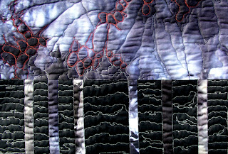
 This was one of my most difficult problem areas that I didn't know what to do with. It ended up being my favorite part. Those pins are 3/4" to give you an idea of the scale. |
 |

Machine Quilting: I wanted to share some of my most valuable tips on machine quilting with you. I photograph my piece, load it into Photoshop, and print it in gray scale on regular paper. I then draw directly on the printout to audition all of my ideas for quilting. If your pen or pencil marks are hard to see, print a lighter copy of the image to work on.
This is especially helpful for large scale pieces. As I am a longarm quilter I often do this with my customer's large landscape or or art quilts so that I have a map of where I am going.
Wednesday, February 02, 2011
New Workshops Posted
I finally have my new workshops posted on my website at http://www.sproulestudios.com/workshops
They are:
They are:
- Shibori with Procion Dyes
- Working with Specialty Fabrics
- Fabric Painting with Setacolor
- Indigo Shibori
Saturday, January 01, 2011
New Year, New Work
I have finished the quilt that I made for my son for Christmas. He was three years old when I made his last quilt, and I thought that perhaps he was ready for a grown up quilt that didn't have Thomas the Train on it. This is also number two in a series of quilts that I am designing to utilize large pieces of hand dyed fabric.

 As with my last piece, the borders ended up being one of my favorite parts. Often the most problematic design challenges become my favorite aspect of a piece.
 |
| Storm, 50" x 75" |
I titled this piece "Storm" for several reasons. I made this quilt in between several bouts of severe weather here on the coast of northern California. I love storms, and the windier and wetter that they are the more I enjoy them. I always have a great view from my studio of the trees whipping every which way in the wind.

Secondly, I have been reading The Wishing Year by Noelle Oxenhandler, and she referred to a man from Pakistan who told her that in his country they believe that dark clouds portend happiness, and rainwater brings showers of blessings. Oxenhandler also wrote,"Clouds represent the soft, receptive yin of not knowing, without which there can be no bright yang of awakening."
This piece was made with hand dyed cotton sateen. I overdyed some of the pieces three times to achieve the colors and striations that I wanted. This was a difficult piece to quilt. One of the things that I attempted to achieve was to create a flow, or connection, from one piece of fabric to the next.
 As with my last piece, the borders ended up being one of my favorite parts. Often the most problematic design challenges become my favorite aspect of a piece.
I am quite enthused about beginning a new year, but I can't really say that I have any New Year's resolutions in mind. My only goal is to be the best that I can possibly be, both physically and mentally, and I would also like to create some really amazing art along the way. I hope that everyone is looking forward to an exciting new year.
Subscribe to:
Posts (Atom)